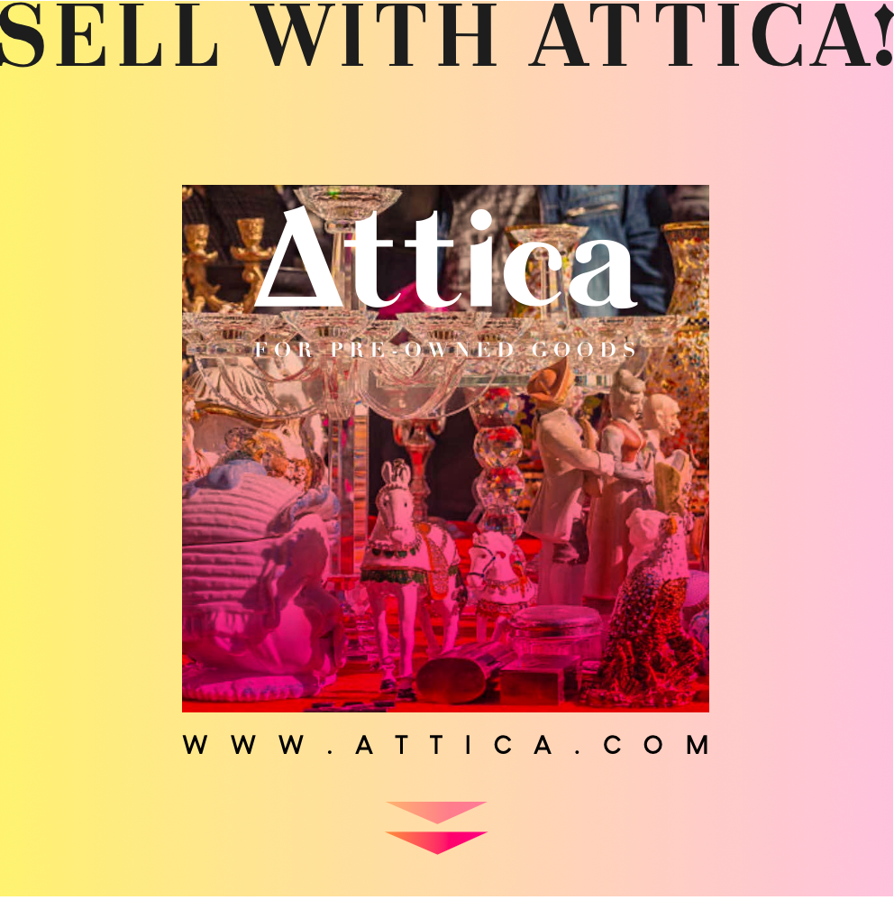
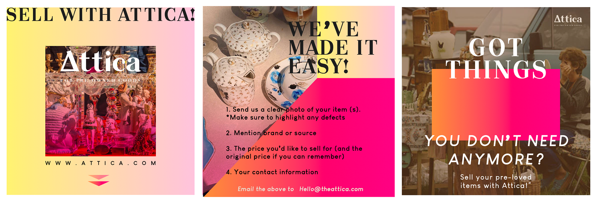
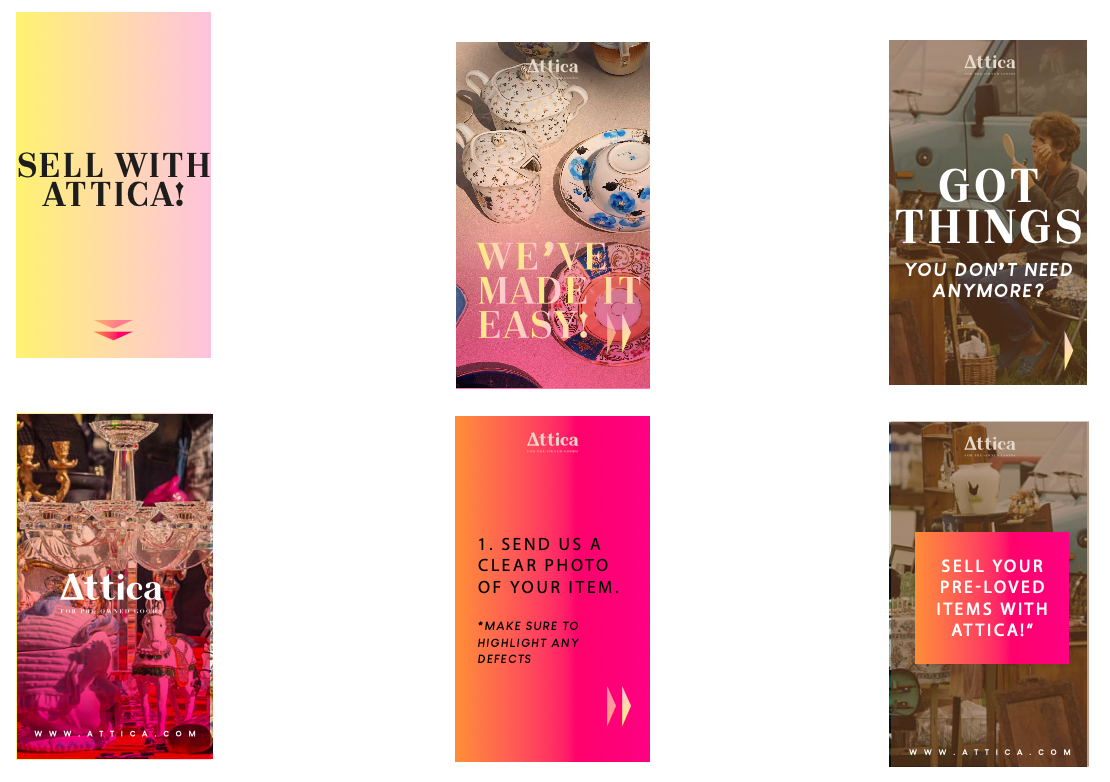
This design captures the eclectic and nostalgic spirit of Attica, a brand specializing in pre-owned goods. The art direction emphasizes vintage charm meets modern clarity, highlighting the beauty of second-hand treasures while positioning them as stylish and desirable.
Visual Style:
A vibrant photograph of ornate collectibles and vintage figurines sits at the heart of the design, evoking a sense of discovery and storytelling behind each pre-owned piece. The choice of rich, warm tones and layered textures reflects the authenticity and character of Attica’s marketplace.
A vibrant photograph of ornate collectibles and vintage figurines sits at the heart of the design, evoking a sense of discovery and storytelling behind each pre-owned piece. The choice of rich, warm tones and layered textures reflects the authenticity and character of Attica’s marketplace.
Typography:
Bold, serif typography for “Attica” reinforces a sense of tradition and timelessness, while clean, modern supporting text (“For Pre-Owned Goods”) ensures readability and balance. The use of uppercase in the CTA “SELL WITH ATTICA!” gives a confident, inviting tone.
Bold, serif typography for “Attica” reinforces a sense of tradition and timelessness, while clean, modern supporting text (“For Pre-Owned Goods”) ensures readability and balance. The use of uppercase in the CTA “SELL WITH ATTICA!” gives a confident, inviting tone.
Color Direction:
The gradient background in soft yellow-to-pink creates a fresh, contemporary contrast against the nostalgic image, signaling Attica’s role as a bridge between the old and the new.
The gradient background in soft yellow-to-pink creates a fresh, contemporary contrast against the nostalgic image, signaling Attica’s role as a bridge between the old and the new.
Layout:
Centered composition keeps the viewer’s focus on both the brand name and the visual richness of the pre-owned items. The clean lower section with the website URL grounds the design and directs traffic effectively.
Centered composition keeps the viewer’s focus on both the brand name and the visual richness of the pre-owned items. The clean lower section with the website URL grounds the design and directs traffic effectively.
Mood & Message:
The overall mood is curated yet approachable, inviting people to see pre-owned goods not as clutter, but as unique, storied items worth celebrating and reselling.
The overall mood is curated yet approachable, inviting people to see pre-owned goods not as clutter, but as unique, storied items worth celebrating and reselling.